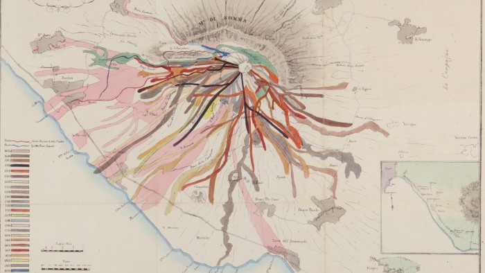
“There is no such thing as an innocent map,” observes Philippe Rekacewicz in his catalogue essay that accompanies Diagrams, a new exhibition at the Prada Foundation in Venice.
A renowned cartographer, the Paris-born Rekacewicz is well aware of his medium’s capacity to transform narratives for good and ill. His own work includes maps that illustrate the deaths of migrants as they bid for new lives in Europe. “A map,” Rekacewicz continues, “is above all a social and political act — and therefore inherently subjective.”
Curated by international architect Rem Koolhaas and his studio AMO/OMA, the Prada show aims to consider diagrams in all their political complexities. Alongside maps, the exhibition’s myriad items include early 20th-century infographics by African-American sociologist WEB Du Bois highlighting racial inequalities; a 17th-century Chinese woodcut of the human circulatory system; and a 2008 map by AMO/OMA themselves showing the top 10 study destinations for students from China and the US.
If this sounds a perilously broad field, it’s deliberately so. “We weren’t trying to map the whole journey,” explains OMA associate architect Giulio Margheri. “We were looking for patterns.” The show, Margheri says, has been themed around “urgencies” including the body, the built environment, inequality, migration, representation of the world, resources, war, truth and values.
Rather than deliver an omniscient chronological narrative, Margheri says the aim was to “deliver moments and episodes”. These are “made more powerful by the association between each other,” he continues. “It was exciting to see how topics were talking to each other across time.”
For example, in the section devoted to the human body, the Chinese woodcuts are juxtaposed with contemporary images. “The information we have about the body changes,” observes Margheri, adding that in earlier times observation and dissection were the only forms of investigation as opposed, say, to modern-day radiography. But, by and large, the body itself remains unchanged, making the similarities between such images as illuminating as the differences.
Primarily, diagrams are platforms for information. “Some look boring,” admits Margheri. “But the minute you study them, you get another layer of understanding.” This is certainly true of an 1869 print charting Hannibal’s journey from Spain through southern France and across the Alps into Italy by French civil engineer and infographic pioneer Charles Joseph Minard. Consisting of a beige band wobbling through almost featureless white space — save for place names, hair-thin pen strokes delineating rivers, and a few hatched lines signifying the Mediterranean — it reveals nothing at first glance of the Carthaginian general’s death-defying rollercoaster as he, his army and his elephants fought off murderous Gallic tribes and confronted rockslides and precipitous descents. But when considered in the light of those challenges, it becomes gripping.
Minard, who died in 1870, hit his stride in the 19th century, during what Diagrams’ curators describe as the golden age of infographics. His diagram of Napoleon’s campaign in Russia maps the retreat through Poland according to his army’s staggering death toll and the sub-zero temperatures. As the men die, Minard’s graphic beige band narrows, delivering a visual chill to chime with that eastern European weather.

Other pictures are equally revealing for what they conceal. Consider the diagram entitled “Universal Commercial History”, a visual analysis drawn up by the Scottish engineer William Playfair in 1805 which traces the rise and fall of global wealth since 1500 BC against what he terms “Remarkable Events Relative to Commerce”. Playfair, who is said to have invented the pie chart, includes moments such as “Rome founded”, “Mahomet’s Flight”, and “America discovered”. He never mentions slavery.
With such a broad-brush approach, lacunae are inevitable. It is a shame that the work of Viennese social scientist Otto Neurath — who, along with his wife Marie and colleague Gerd Arntz, invented the Isotype (International System of Typographic Picture Education) — is not on show. Based on pictograms, Neurath’s Isotypes are an important forerunner to the digital vernacular (from emojis to icons) so familiar to us today. Nor does the exhibition include maps of the devastation of Gaza since October 2023, such as those made by investigative research agency Forensic Architecture, which are proving among the most critical diagrams of our time.

It is important to note OMA’s own connection to the lagoon city. In 2009, it began its redevelopment of the Fondaco dei Tedeschi. Dating back to the 13th century, though rebuilt in the early 1500s, the spectacular building had served as a public post office until it was acquired by Benetton and transformed into a luxury shopping centre. Later leased to the LVMH group, it became home to the latter’s Hong Kong-based retailer DFS. But late last year, the Fondaco abruptly announced its closure due to €100mn in losses.
The Fondaco’s plush interior, complete with gilded surfaces and red escalators, is a glossy yet troubling fusion of a 21st-century hypercapitalist skin stretched over a centuries-old skeleton. It would have been fascinating to see the diagrams for that renovation.
Yet the dynamics behind the Fondaco’s demise, speaking as it does to glitches within tiny Venice’s paradoxically global marketplace, do tie into one of the most fascinating diagrams in the Prada show.
Entitled “The World Model” (1972), the monochrome flow-style chart connects subjects such as industrial capitalism, mortality, pollution and food production. Published as part of a report entitled The Limits to Growth for the Club of Rome, it illustrates the unsustainability of unchecked economic and population growth. For that provocative image and many others, this show is surely worth a visit.
May 10-November 24, fondazioneprada.org
Find out about our latest stories first — follow FT Weekend on Instagram and X, and sign up to receive the FT Weekend newsletter every Saturday morning
Leave a Reply