Blog

  • Richard Rogers at Sir John Soane’s Museum — high-tech architecture meets neoclassicism

    Richard Rogers at Sir John Soane’s Museum — high-tech architecture meets neoclassicism

    It’s often interesting, if not always useful, to compare architects from distant and more recent history. A new exhibition of the work of Richard Rogers at Sir John Soane’s Museum in London affords an opportunity to play that game, noting the occasional similarity or echo, and then the howling chasm, between these two hugely influential architects, born 180 years apart. 

    The show concentrates on a handful of buildings to explore the themes that preoccupied Rogers over his long career, from modular construction to sustainability and social cohesion. It kicks off with the Zip-Up House, designed in 1967-69 by Rogers and his wife at the time, Su, and exhibited, surprisingly, at London’s Ideal Home Exhibition in 1969. An extruded yellow box supported on pink props so that it didn’t need foundations and could, in theory, be moved to any site with any topography, it remained visionary, striking and resolutely unbuilt.

    He did, however, build a version for his parents in Wimbledon, still standing, still exquisite, if not perhaps the easiest house to actually live in. The original model, standing in the middle of the room, is terrific, a real blast of space-age bravado.

    Rogers’ Wimbledon house, built for his parents © Arcaid
    An architectural model of a single-storey building on pink support struts with floor to ceiling windows
    A model of Rogers’ Zip-Up House © Gareth Gardner

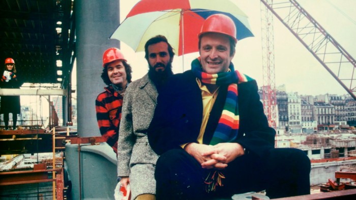
    Next up is the Pompidou Centre, Rogers’ undisputed masterpiece (designed with Renzo Piano) and still perhaps the most radical reinvention of what a cultural building could be. Leaving half the Paris site free for a public piazza and creating a flexible interior, it became a massive warehouse for culture capable of reprogramming and reimagining as slippery media shifted. The conceptual model is tiny and gorgeous, in contrast to the beast it begat.

    Then, in slightly similar vein, comes London’s Millennium Dome, the vast circular tent designed as the most efficient way to cover the largest area but with a New Labour vacuity at its core, a struggle to fill it with expo-lite exhibits. It is now a hyper-corporate, albeit efficient, gig venue surrounded by fast-food franchises — as perfectly of its era as was the Pompidou.

    There is also the Lloyd’s building in its shiny armour of stainless steel vents, ducts, lifts and panels, a powerful reinterpretation of London’s fetish for Victorian iron engineering (like Leadenhall Market next door). Then there is the rest, from an unbuilt housing tower to the compact energy of the drawings gallery at Château La Coste and the details of the vast Barajas Airport in Madrid. 

    A construction site with large steel lever-like girders
    Construction of the Pompidou Centre, including the assembly of the prefabricated steel ‘gerberettes’ for the structure © Bernard Vincent/Pompidou

    All of this is framed against a shocking pink, like that of the garish collarless shirts Rogers himself used to sport. In this there is an echo of Soane. Move from the pink room to the (historic) sunny yellow drawing room next door and you get a hint of Soane’s own experiments with colour.

    There is also something oddly effective in displaying these representations of buildings on an epic scale in Soane’s intimate domestic rooms. Rogers arguably succeeded where Soane failed, in building grand public spaces and shaping cities. Soane’s only real result in this game was the huge Bank of England (on which he worked between 1788 and 1833), almost all of which is now gone. His dome there may have been an influence on Rogers’ millennium version, as indeed might the smaller one in his breakfast room here in the house. 

    Despite his global success Rogers, too, failed to achieve many of his professed ideas. There is a suggestion here of his undoubted efforts to produce an architecture of real and progressive social value. Yet he managed to build virtually no social housing in his lifetime, and his later monuments from Lloyd’s to the “Cheesegrater” at 122 Leadenhall Street were corporate monsters, while his housing, from One Hyde Park to Neo Bankside, was exclusively for London’s ultra-wealthy.

    A colour sketch of a site plan for a house
    Roger’s sketch of plans for his parents’ house in Wimbledon, connecting to Wimbledon Common © RSHP

    Rogers was a notoriously bad draughtsman, his sketches, like his writing, often barely legible. His medium was social, getting an office to work together. Soane was a little better, but he employed Joseph Gandy to create memorable images of the work, often after they had been completed. Gandy rendered Soane’s work in collages and, in one famous painting of his buildings stacked up in a room, somewhere between models and surreal doll’s houses. Most famously, he depicted Soane’s Bank of England in ruins, as if these works would leave remains like those of Rome, influencing generations to come, building the myth as well as the work.

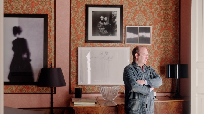
    That Rogers was a sketchy sketcher might have mattered not at all, but there are no credits on these drawings, some of which are spectacular, and that appropriation feels a little unfair. It would have taken nothing away from Rogers to see who, from Eva Jiřičná to Graham Stirk, was responsible. The exhibition was designed and curated by Rogers’ son Ab, who inherited from his father that penchant for vivid colour. No historic parallel there — Soane was desperate for his own son to follow him into architecture, but his lack of interest and then a ruthless attack on his father’s reputation in a magazine (after Soane had refused to pay his debts off) was blamed for driving his mother to an early grave and Soane to disinherit him.

    There are parallels in the deceptive blend of clarity and complexity. Both architects’ buildings can appear to be simple, even bombastic statements, yet they also reveal layers of depth and entanglement with history and the physical city that keeps them fascinating.

    The inside of a tent-like dome (the Millennium Dome) containing exhibits
    The Millennium Dome, showing the themed zones during its original configuration © Katsuhisa Kida/Fototeca
    A colour drawing of a site plan for the interior of a circular building
    A drawing by Rogers of a plan for the Millennium Dome © RSHP

    It is jarring to see the first UK retrospective of one of Britain’s most successful high-tech architects in a house stuffed with fragments of classical architecture and sculpture. But it reminds us that Rogers himself was born in Florence, a product of the same culture of the piazza, the ruin and the continuity of urban history that defined Soane. Perhaps his house too, so emblematic of its age — a 19th-century pair of terraces stripped bare and opened up inside — and just around the corner from Soane’s stables at the Royal Hospital, might one day become a museum too.

    To September 21, soane.org

    Find out about our latest stories first — follow FT Weekend on Instagram, Bluesky and X, and sign up to receive the FT Weekend newsletter every Saturday morning

  • the era’s elegant houses are levelling up

    the era’s elegant houses are levelling up

    Built into the wall of one of the airy bathrooms at Ashton, an Edwardian country house in Somerset, is a set of spacious mahogany drawers. The house is filled with useful original features like this: generous baths with sturdy taps, large built-in basins in bedrooms, and a huge loft room where the current owners’ five children keep a train set. Amanda Campbell, who has lived there for more than 30 years with her husband, says she was seduced by the house’s generous proportions and light-filled rooms. “There is nothing poky about it,” she says. 

    Britain is in the throes of nostalgia for Howards End-style houses such as Ashton and the interior decor of the early 20th century. The era’s art nouveau-style stained glass and muted-tone, geometric tiles are trending on social media, while online searches for its bathrooms and gardens have increased by as much as 100 per cent in the past 12 months. Edwardian country houses, with their beaky gables, square bays and timber detailing “used to sell for up to 10 per cent less than Victorian homes”, says Robin Chatwin, head of Savills’ south-west London residential sales, “but now there’s no difference — many buyers prefer an Edwardian house.” 

    The former Dorset house of architect and designer Ben Pentreath, decorated with Morris & Co wallpaper from his Queen Square collection © Peter Dixon
    White bedroom with carved plaster ceiling, floral headboard, leaded window, and pleated fabric lampshades
    A guest bedroom in an Edwardian house in Cornwall by Pentreath © Ben Pentreath

    Edwardianism speaks to the past and the future, which is why it resonates today, says interior designer and architect Ben Pentreath, who has recently moved to a house with Edwardian interiors on Rousay in the Orkney Islands. “There’s a sense of modernity to good Edwardian design,” he says. “Light-filled spaces, layouts that flow from one room to the next, [rooms] infused with poetry . . . themes that would inspire modernism just a few years later.”

    It also offers a sense of optimism and hope, he continues. After the sombre final decades of Queen Victoria’s reign, the accession of King Edward VII and his socialite wife Queen Alexandra brought light and colour to British fashion and interiors — as can be seen in the exhibition The Edwardians: Age of Elegance, at Buckingham Palace (until November). A painting by Danish artist Laurits Regner Tuxen, for example, shows ladies at a Buckingham Palace garden party dressed in pastel shades, a palette mirrored in the hand-painted floral occasional chairs and Danish ceramics on display. “There can be a real prettiness to Edwardian decor — the paint colours, the tiles, the fabrics,” agrees interior designer Kate Guinness, who has recently refurbished an Edwardian house in south-east London. 

    Hallway with wood-panelled walls, turned staircase balusters, patterned rug, and a grey upholstered sofa
    The hallway of an Edwardian house in London decorated by Pentreath © Ben Pentreath

    The era’s handcrafted furniture was often influenced by the medieval style favoured by Arts and Crafts designers such as William Morris. “It has a sense of peaceful comfort,” Pentreath adds. “The Edwardians had wonderful budgets — fuelled by the late-stage empire and British manufacturing prowess — which means that the quality of the work and materials shines through.”

    Houses of the time — Edwardian architectural style extends from 1901 into the early 1920s even though Edward VII died in 1910 — reflect this comfortable aesthetic. With fewer staff than the Victorians, the Edwardians were forward-thinking designers, prioritising kitchens, bathrooms and family living space. The main rooms are most often designed for both formal dinners and children racing around after school. “There’s a wonderful confidence to the houses — they’re solid, adaptable and never overly fussy,” says Oliver Custance Baker, of estate agents Strutt & Parker’s country house department. The Edwardians were also garden-mad, she adds, designing houses with front and back gardens and living spaces that flow outdoors to structured planting and herbaceous borders. 

    Bathroom with a white tub, chrome taps, yellow patterned wallpaper, blue curtains, and vase of tulips
    Generous sizes are characteristic of Edwardian houses, as with these mahogany drawers and bathtub at Ashton house . . . 
    Bathroom sink with red tiled splashback, white cabinet base, floral curtain, and a sash window nearby
    . . . and this large built-in basin in one of Ashton’s bedrooms © Apple Photos Clean Up

    “Lutyens is the most famous of the great Edwardian architects, but he was but one of a huge generation of talents — Mackay Hugh Baillie Scott, Guy Dawber, Ernest Gimson, [C.F.A] Voysey,” Pentreath continues. “They drew deeply from the well of tradition without ever being dull.”  

    At Ashton, built in 1914 for a colonel returning from India, Campbell has created a garden inspired by the horticulturalist and garden designer Gertrude Jekyll, with a pool and tennis court. Like most Edwardian houses, it isn’t listed, so she was able to open up rooms even further for modern lateral living, creating a vast kitchen with areas for sitting, dining and watching television, all with doors on to the garden. 

    Her one regret is that she never went “full William Morris” with the interior; this will be for the next owner, as Campbell and her husband are looking to downsize. Pentreath, however, likes to juxtapose Edwardianism with other period styles. “It combines beautifully with mid-century furniture, abstract art and sculpture in a way that would feel a little jarring or over-obvious in a Georgian interior,” he says. 

    A sitting room with sculptural round table, floral centrepiece, bookshelves, and modern lighting
    An Edwardian house in Camberwell, south London, recently refurbished by Kate Guinness . . .  © James McDonald
    Bedroom corner with patterned textiles, bobbin chair, framed minimalist prints, and a colourful woven rug
    . . . and Guinness’s own Edwardian home in south-east London, with a bobbin chair © Sebastian Boettcher

    Pentreath feels lucky to have Edwardian fireplaces with William De Morgan tiles at his new home. In many houses, Edwardian fixtures — such as original parquet flooring — have been ripped out. It’s now being reinstalled, says interior designer Max Buston, who suggests using narrower planks for a historic feel. 

    Some content could not load. Check your internet connection or browser settings.

    Guinness avoids the heavier pieces of furniture — the elaborate mahogany sideboards with heavy scrolling and inlaid swags, for example — but she loves bobbin chairs and the striped and floral furnishings (Pentreath suggests a trip to antique dealer Puritan Values in London to find great pieces). She recommends giving chairs “a new lease of life with a new fabric” and points to striped fabrics by Hamilton Weston or Ian Mankin — as well as Adam Bray’s brown paper stripe wallpapers. Buston favours the striped fabric and papers of Pierre Frey and Anna French, and pastel paint shades such as Lucca blue by Edward Bulmer. 

    Floral upholstered chair on wooden floor set against sepia-toned mural with giant artichoke and temple
    Sanderson x Giles Deacon wallpaper
    Kitchen sink with brass tap, marble worktop, leafy blue floral wallpaper, and hanging glass pendant light
    Morris & Co’s ‘Sweet Briar’

    For floral wallpaper and fabrics, both Morris & Co and Sanderson are obvious choices, both being founded at the time; according to Claire Vallis, design director of the Sanderson Design Group, patterns from the early 1900s such as Lerena, a quintessential Edwardian pattern by Voysey, and Rose and Peony, are top sellers.

    Even without the croquet parties and cream teas of the “long Edwardian afternoon”, it’s an aesthetic filled with languor and joy, says Campbell. 

    On the market

    Tudor-style country house with red brick chimneys, timber framing, and circular gravel drive amid rolling hills

    Ashton, Somerset, £2.95mn An eight-bedroom house built in 1914 in 8.79-acre grounds on the edge of the village of Chaffcombe, with a swimming pool and tennis court; through Strutt & Parker.


    Grand English manor with tall chimneys, ivy-covered stone facade, and formal lawns bordering dense woodland
    © Chris Curl

    Whitney Court, Herefordshire, £3mn A 10-bedroom house above the village of Whitney-on-Wye, surrounded by 22 acres of gardens and parkland; through Savills.


    Edwardian-style house with red brick and white render, bay windows, blossoming tree, and gated drive

    House, Putney, London, £3.5mn-£3.85mn A detached house built for Charles Rolls, co-founder of Rolls-Royce, in 1909, with six bedrooms and a landscaped garden; through Wilfords. 


    French-style château with red roofs, formal gardens, and circular drive set in expansive parkland

    Middleton Park, Oxfordshire, £18mn A 27-bedroom Lutyens masterpiece, converted into 16 apartments, with formal gardens and a cricket pitch, swimming pool and tennis court; through Savills.

    Find out about our latest stories first — follow @ft_houseandhome on Instagram 

  • Why don’t we design our homes with acoustics in mind?

    Why don’t we design our homes with acoustics in mind?

    Why don’t we design our homes with acoustics in mind?

  • In pictures: St Paul’s marks 350th anniversary with rare glimpse of its inner sanctum

    In pictures: St Paul’s marks 350th anniversary with rare glimpse of its inner sanctum

    In pictures: St Paul’s marks 350th anniversary with rare glimpse of its inner sanctum

  • Not just a pretty facade — does your home need a facelift?

    Not just a pretty facade — does your home need a facelift?

    “To me, the facade of a building is like the first sentence of a novel — it sets the tone, the mood, and hints at what’s to come,” says German architect Alexis Dornier of Alexis Dornier Makings. 

    When designing a house, the primary consideration is most often how the owners will live and occupy the space inside. But for many architects, the front elevation is also a compelling plane for experimentation. Increasingly they are using it not just as a decorative flourish, a charismatic facade for those looking in, but also to raise the bar for personalised design, and to tackle some of the practical and climate-related challenges of our times in new ways.

    The facade of Flow House, Bali, by Alexis Dornier, mimics the shape of a sound wave, improving the interior acoustics © Tommaso Riva/Alex Dornier Makings

    For Flow House, a project in Bali, Dornier responded to the musician client’s request for a “calm” property by creating an undulating architectural facade that mimicked the shape of a sound wave. The vast curving glass front is met by a sharply dipping, parabolic roof. The curves of the wood-clad ceiling it creates inside improve the acoustics of the home, which is now used as a base for artists’ residencies and includes a recording studio. 

    While constructed mostly from concrete, the architect wanted the residents to feel like they were connected with their surroundings. Swaths of glass provide panoramic views of the rural setting, the master bedroom has its own private garden with an outdoor shower, and the first-floor mezzanine swoops down to meet a conically shaped staircase, almost flowing to the pool below and the rice paddies beyond. It is part of the Pennjiwann community near Ubud, a small group of homes blending “minimalistic avant-garde” and “classic Balinese” style.

    Boxy two-storey house with textured pale brick façade and minimal openings set on a quiet suburban street
    Canvas House in Toronto, designed by Partisans studio for a client with a background in theatre production, has a rhythmic facade that echoes a theatre drape

    While Flow House is situated among fields and coconut trees — an open space where its possible to set the architectural tone — the rippling Canvas House in Toronto, Canada, sits between the large early-20th-century Georgian and French Colonial-style homes of the Forest Hill neighbourhood. Completed in 2022, the result enlivens a residential street in an area where the people are “open to architectural dialogue and evolution”, says its creator Alex Josephson, co-founder of architectural studio Partisans. “This house acts as both foil and focal point, balancing boldness with contextual sensitivity.”

    The client, an art collector with a background in theatre production, “desired a home as a personal expression”, says Josephson, so he took inspiration from American abstract artist Larry Poons’s dot paintings when creating the masonry pattern. Meanwhile, the “rhythmic facade”, as the architect describes it, is a randomised pattern “arranged like the motions of a theatre drape”. Inside, in contrast, the smooth, clean white interiors serve as a simple background for the client’s collection. The resulting home mimics the size of the detached houses beside it, and similarly keeps the suburban lawn and driveway — but with its single window, and wrapped with a rounded and bulging pixelated pattern of bricks, it seems like an alien among them.

    Narrow metallic building with corrugated façade wedged tightly between older red-brick residential structures
    Bomun House’s clean and commanding exterior appears windowless yet lets light in while providing privacy © Joel Moritz

    Other projects that boldly juxtapose with their surroundings include Atelier Itch’s 2024 Bomun House, a shining monolith among the crowded dark brick buildings of a narrow Seoul alleyway. Corrugated, lightweight steel wraps around the narrow, four-storey home’s external, road-facing staircase, creating a clean and commanding exterior. The facade appears windowless but lets light in while providing privacy, and extends upwards to fence the rooftop terrace.

    Maison KN by Nghia Architect, meanwhile, is a tall red structure characterised by a patchwork of solid and barred squares in the historic centre of Hanoi, Vietnam. Built for two siblings and completed in 2023, it was designed so that it could later be reconfigured to accommodate their two separate families. Extending over seven floors, the facade also extends to act as both a ground-floor courtyard and a third-floor garden, providing ventilation but also ensuring privacy in the crowded neighbourhood. “We were initially keen to dial down the boldness of the exterior,” say the owners, but “the architects’ vision of the house being a ‘sculpture’ stood out.”

    Tall, narrow red building with angular cut-outs and glowing interior set among tightly packed urban rooftops
    The facade of Maison KN by Nghia Architect in Hanoi, Vietnam, extends to act as a ground-floor courtyard and third-floor garden © Nguyen Viet Tien/Nguyen Tuan Nghia

    Such new buildings can spark an interesting dialogue with the surrounding architecture. State of Kin’s Brick House, in the Mount Lawley suburb of Perth, Australia, was built in 2019 from red bricks salvaged from historic Federation-style homes that had been demolished nearby. This reuse of local material was an attempt to respect both heritage and sustainability. “We see it as a conversation with its surroundings and the residents,” says Ara Salomone, director of architecture at State of Kin. 

    While constructed from traditional materials, with a classically shaped pediment above the driveway, the rest is a joyful jumble of shapes, with both square and porthole-like round windows, and a jagged, sawtooth roof that references traditional factory buildings. The playful spirit continues inside with a net hammock suspended over the living space. “It doesn’t shy away from being bold, but it’s also deeply rooted in place,” says Salomone. 

    Two-storey house with red brick façade, arched garages and large round window. A woman passing by, walking her dog
    The facade of Brick House in Perth, by State of Kin, uses bricks salvaged from historic Federation-style homes © Jack Lovel/State of Kin

    “The use of reclaimed red brick allowed us to craft an exterior that’s richly textured and layered, one that [plays with] light, shadow and time,” adds Salomone, who created interiors that also feature exposed brick throughout, including a cellar with a herringbone ceiling. “Every curve and angle was carefully considered to create rhythm and depth.”

    With a similar nod to local history, “facadism” sees the architecturally notable street-facing walls of homes preserved, while the building behind is demolished to make way for a modern construction. But in Bengaluru, India, AJ Architects has played with the practice. Recently tasked with modernising a dated brick and render villa on the busy Mahatma Gandhi Road, they reconfigured the interior and added three dynamic, curved sail-like structures to the exterior, embedded with lights to create a glowing silhouette at night. Constructed from tensile fabric on a tubular steel frame, these decorative elements offered more than a facelift, says founder Arvind Jain. The three structures are “camouflaging the existing structure from the harsh west-facing sun by creating an air gap between the brick walls and the fabric facade, which also helps reduce energy consumption.”

    Modern house with glowing wavy panels and large windows, dramatically lit against a deep blue evening sky
    In Bengaluru, India, AJ Architects’ glowing sail-like structures protect a villa’s interior from harsh sun

    Adapting facades to better cope with climate change is an active preoccupation. Non-structural curtain walls, made from glass or other lightweight materials, can act to protect a building from the elements. Using sensors, kinetic facades can automatically move into place to shield a building as the weather changes. 

    In Leiria, Portugal, Didier Fiúza Faustino of Bureau des Mésarchitectures took an imaginative approach to the particular challenge of protecting the residents of the 2024 Martires Housing Complex from the baking sun. “Due to the total area of the site and the urban regulations, the apartments could not have balconies,” says Fiúza Faustino. Instead, the seven flats, located in a semicircular building whose shape mirrors the roundabout beside it, were fitted with vast windows. To combat the heat trap, Fiuza Faustino designed a carapace of golden shutters and sandy precast concrete, coloured to complement the traditional yellow-painted exterior of the adjoining house (the area is under a heritage preservation rule). “By playing with the aluminium shutters, [residents] remain the masters of their home and are able to give their interior space more intimacy,” he says.

    Geometric three-storey building with gold-framed windows and textured folding shutters on a cobbled street
    A carapace of golden aluminium shutters gives residents control of sun infiltration in this building designed by Bureau des Mésarchitectures in Leiria, Portugal © Francisco Nogueira/Bureau Des Mésarchitectures

    “It’s all about using honest, tactile and enduring materials — like brick, timber and steel — not just for their visual qualities, but for the way they age and evolve over time,” says Salomone. 

    But as more homeowners engage with their exteriors in dynamic ways, creative alternatives are shaking up the path ahead. Bioplastic 3D-printed curtain walls, sculptural photovoltaic skins and data-responsive surfaces are being developed. Some radical new faces await.

    Find out about our latest stories first — follow @ft_houseandhome on Instagram

  • Materials rethink underpins architecture’s sustainability push

    Materials rethink underpins architecture’s sustainability push

    The ultimate problem for architects is that the most sustainable building is always the one that is already there. There is a huge amount written about green buildings, much of it nonsense. There is some confusion about buildings layered in vines and living walls, stacked high with plant pots, and buildings that actually are green.

    Contemporary architecture’s issue is mostly embodied in one material: concrete. Some 8 per cent of all CO₂ emissions are attributable to concrete, the most used material on Earth after water. The rate at which we are still using it is astonishing: half of all the stuff manufactured by weight is concrete. From 2011 to 2013, China used more concrete than the US had in the whole of the 20th century. The construction industry has become helplessly addicted to the protean grey sludge that can be so easily formed into almost anything.

    There are signs, however, that architects are beginning to shake things up.

    The first credible alternative is, perhaps a little ironically, that oldest of building materials, timber. The pioneering use in Austria in the 1990s of cross-laminated timber (CLT), in which layers of lumber are built up, their grains running in opposing directions, into a very tough laminate, led to a new sustainable direction.

    The flexibility of CLT has led to the “tall timber” movement and “plyscrapers” — towers constructed entirely of wood. There has had to be some significant adjusting of fire regulations for the new wonder-material (long avoided in high-rise situations precisely because of its flammability), but the problems are being overcome.

    One of the first significant CLT buildings was a research centre into the material itself, the Bautechnikzentrum (building technology centre) at Graz University of Technology in Austria (2001), an impressive, industrial-scale structure.

    Subsequently, British architectural practice Waugh Thistleton has been a pioneer in the field with its nine-storey Murray Grove housing block in Hackney, east London, in 2009. More recently, its Black & White Building in nearby Shoreditch (2023) is an unusual mass timber office building, with everything from floors to facade in wood, with an intimate, warm feel throughout — a building that performs as well as any other, but far more sustainably.

    The Black & White Building in London, a mass timber office block © Alamy

    For an even more extreme example you might look to Hermann Kaufmann’s 2013 IZM building, perched over a lake for a hydroelectric dam in Vandans, western Austria, an elegant wooden structure both sustainable and beautiful.

    Japanese architect Shigeru Ban has been working in wood for decades but also employs the even more sustainable, fast-growing bamboo in his buildings (his Blue Ocean Dome at the Osaka Expo 2025 is impressive). He has also employed his characteristic cardboard tubes for emergency shelters at disaster sites around the world.

    Wood has become popular in part because it is familiar and obviously sustainable but also because of a kind of sleight of hand. The capacity of trees to absorb carbon during their lifetimes gives timber buildings a head start, in theory at least, beginning with a negative carbon count.


    Another familiar material making a return to the sustainable arena is stone. You might think it never went away, with big, self-declared sustainable blockbusters such as Foster + Partners’ Bloomberg Building in the City of London being clad extensively and extravagantly in the material. Stone used to be employed as both structure and finish but today is more likely to be applied as a veneer of cladding over steel and concrete.

    Architects have more recently been questioning this approach and returning instead to stone as a structural material, cutting out the other, far less sustainable materials.

    In Mallorca, where stone is a genuinely local material, architects have been attempting to revive disused quarries and revitalise local material supply chains to create extremely fine new social housing.

    One practice, IBAVI, was responsible for a raft of small housing projects, modest but well designed and crafted, and responding to local need on an island where so much construction caters for tourism. Its housing on Salvador Espriu (2022) emulates the vernacular in scale and style using local timber and stone, much as builders would have done centuries ago. The architects have had to redefine local supply chains to get here, stimulating local economies — a long and involved process but one with admirable results.

    Rammed earth has also been proving popular recently. Suphasidh Architects’ mixed-use building in Chonburi, Thailand (2024), is a remarkable demonstration of the richness of the material in colour and texture. French architects Déchelette even used it on a Paris apartment block in the suburb of Boulogne-Billancourt (2024).

    Long decried as rural and primitive, compressed earth and mud-brick are being revived as a super-sustainable material (no need for carbon-intensive firing) that bonds the building to its site in a very visual manner, creating a sense of place through material — architectural terroir.


    Yet it remains the case the building that is already there is the most sustainable.

    Paris-based architects Lacaton & Vassal, whose motto is “never demolish”, have become known for imaginative and elegant reuse. At the Tour Bois le Prêtre (2011) on the edge of Paris, they took an unpromising social housing slab of a tower and allowed the residents to stay inside during the works, thus maintaining continuity — something so often lost with big construction projects. It reminds us that sustainability ought to apply to communities as well as materials.

    Rather than demolish, they clad the tower in a layer of extra space, cheaply wrapped in polycarbonate (with sliding sections), to create new terraces, winter gardens and balconies, expanding living space and allowing residents to customise their new areas with greenery. The result is elegant and economical, isolating the apartments while expanding and allowing them to breathe.

    We also need to consider Rotor. This unusual practice tends to get a little left out of sustainable architectural discourse because it builds little itself. But what it has achieved is nevertheless remarkable.

    Based in Brussels, it began by disassembling buildings about to be demolished or refurbished, salvaging what was reusable, from doors to marble tiles and bathroom fittings and, in a perfectly circular manner, sold these on to architects who wanted a little more texture and character inserted into their buildings.

    The practice has also undertaken extensive studies of waste in the industry and defined strategies for reuse and repair. Its Brussels warehouse is a truly remarkable place, rammed with hardware, 1970s bathroom tiles, marble panels and huge glass partitions. A whole, remarkable circular world in itself.

  • ‘In Britain, this is a church of immigrants’

    ‘In Britain, this is a church of immigrants’

    We might not logically associate modernism with Catholicism but there was a moment in the early 1960s when the Church found itself suddenly, and perhaps unexpectedly, in the vanguard. Among the radical changes instituted by the Second Vatican Council (1962-65) was a rethinking of how the physical church should be arranged. The priest was to face the people and the altar was brought into the body of the building; what had once been a profoundly hierarchical space was made accessible, and the congregation found itself at the centre of the mass rather than just on the receiving end.

    This coincided with a period of urban revival, a recovery from wartime privations and, in the UK, an explosion in numbers of Catholics that was engendered by fast-growing families and by immigration — from Ireland, Italy and beyond. This sudden proliferation of Catholic churches, which were mostly modern in style, often striking and occasionally astonishing, forms the subject of Here We Are, a new film by artist Elizabeth Price showing at the Liverpool Biennial, the UK’s largest free festival of contemporary art. 

    I visit Price at her south-east London studio, where she greets me wearing a chic brown boiler suit and makes a few excuses about the broken, gaffer-taped chairs we sit on. Otherwise, it’s all pretty neat for a studio. Most of her work takes place at a desktop with two big screens. Price appears extremely modest and, for an artist who won the Turner Prize (in 2012), is still oddly unsung. Her winning entry was “The Woolworths Choir of 1979”, a haunting video work that mixed music and tragedy: images of a deadly fire in a Woolworths store in Manchester that killed 10 people; grainy film of 1960s girl group The Shangri-Las doing their synchronised song-and-dance routines; people singing in church. The barely perceptible thing that subtly connected all three was a kind of twist of the wrist, a little hand motion that provides a kinetic thread through the seemingly disparate moving images.

    A still from Elizabeth Price’s ‘Here We Are’ (2025) shows St Margaret Mary’s Church in Knotty Ash © Courtesy of the artist

    In her work for Liverpool, the church is very much back, but this time the thread is postwar architecture rather than that delicate wrist-flick. What, I ask, inspired this particular work? “It was triggered by a visit to St Bride’s Church in East Kilbride,” she says, “this incredible church by [architects] Gillespie, Kidd & Coia. You feel how the building folds you into it and inside, like you’re at the bottom of a well.” 

    The church, a blocky brick monument, embraced elements of Scottish castles, Charles Rennie Mackintosh’s Glasgow School of Art, brutalism and Swedish modernism, and was among the fiercest expressions of the new spirit in Catholic architecture. It is characteristic of the revered (but also perhaps still underrated) architects, who also designed St Peter’s Seminary in Cardross, one of the era’s most influential ruins: a dark, charged space now riddled with graffiti and the paraphernalia of headbangers, satanists and junkies. But St Bride’s is still an active church and a place of community. “It’s in my own background,” Price says. “I’m originally from an Irish Catholic family, and religion had a very profound impact on me.” She adds that she is no longer a practising Catholic.

    “I thought a lot about the relationship between modernism and Catholicism,” she says, “and they don’t quite map on to each other. There are these incongruities between modernism and conservatism and the role, the subservience of women. This was about finding a niche which gives you a purchase point to start picking away at these inconsistencies, about the way Catholicism and modernism were able to reveal things about each other.”

    An image from a video shows, in negative, a modern-looking church building with a series of pitched roofs
    St Teresa, Penwortham, in Elizabeth Price’s ‘Here We Are’ © Courtesy of the artist

    Price was born in Yorkshire in the north of England but grew up in Luton, just north of London. “Our church was a bit art deco,” she says, “not that much to look at. But as a child I remember being bored in mass and you begin to play in your mind with the sculpted images, the sounds, the music. It becomes a whole imaginative realm, part of the seduction of religion, part of your education. And the images are hugely important.”

    She might have been inspired by the stark power of St Bride’s but as she scrolls through a rough early cut of the film on her screens, the first few churches (a mix of historic photos from the Royal Institute of British Architects’ collection and others newly commissioned from Andrew Lee) are modest affairs, ordinary architecture.

    “They’re very much embedded in their communities — a part of them,” she says. The boxy 1960s churches look nothing if not suburban. “As I was going round photographing the churches I realised I understood it all,” she says. “I spoke Catholic, I knew what all the bits of churches were called. It was familiar. I have a fascination for the gothic but also those threads of goth that run through modernism. It looks simple but it has these complicated memories running through it . . . both a joyful togetherness and something darker and more mysterious.”

    More than a thousand Catholic churches were built in Britain between 1955 and 1975. As the film progresses, the architecture becomes starker, more expressive. The buildings evolve from the cheery suburban modern to a more monumental, moody feel. The images too are dark, beginning as negatives and moving through to positive and then colour-restored, which gives the film an eerie, dreamlike quality. Providing a kind of happy ending is HS Goodhart-Rendel’s Most Holy Trinity in Bermondsey (1957-60), south London, which looks as if it belongs to another age, exuding a dark expressionism.

    An image from a video shows a church building, largely in negative, with the image split into three sections showing the church from different angles
    Saint Michael and All Angels, Birkenhead, in Elizabeth Price’s ‘Here We Are’ © Courtesy of the artist

    Likely to be particularly resonant at the biennial are the churches of FX Velarde, a Liverpool local who built eccentric hybrids of Gothic, Romanesque, modernism and art deco. Liverpool has its own Catholic landmark, of course: the great cathedral with its crown of thorns, designed by Frederick Gibberd, which was last week listed at Grade I, the highest form of protection. I ask if it too is included, but Price tells me she concentrated on parish churches, situated in communities.

    “There are always other things going on in these churches,” Price says. “There are the legible histories of migration, postwar reconstruction, often traumatised or homesick communities. In this country this is a church of immigrants. They are places where poorer migrants can say ‘Here we are.’ They are about more than Catholicism.”

    To September 14, biennial.com

  • ‘It’s like having a Dyson purifier embedded in your walls’

    ‘It’s like having a Dyson purifier embedded in your walls’

    As the clay-plaster walls of architect Josh Piddock’s north London apartment were drying, he decided to inspect the finish. Captivated by its tactility, he could not resist touching the “sandcastle”-like surface. The deep fingerprint he left behind doesn’t bother Piddock. It only adds, he says, to the perfectly imperfect appeal of his interior; the natural tones and textures a gentle nod to the golden London stock brick of the 1920s home. 

    Usually associated with traditional rural buildings, clay plaster — a mix of sand, natural fibres and earth — is a niche finish sold by just a handful of suppliers in the UK. But as architects and designers rediscover the ecological — and aesthetic — perks of homegrown earth-based materials, perceptions are shifting. It is now a high-end choice for apartments, town houses or swish new-builds.  

    The Mondrian-like grid of burnt orange, parchment and dove-grey tones at the home of Studio Merlin architect Josh Piddock © Richard Chivers

    When Cornwall-based Adam Weismann founded specialist supplier Clayworks in 2010, he encountered scepticism. “Ironically, it can feel too natural for some people. They were worried it might fall off the wall. Part of our job was to educate.” His mission paid off. More than a decade and a half later, “now architects come to us,” says Weismann, who has travelled to countries including Japan and Morocco to study indigenous earth techniques, and co-authored two books on the subject with his wife Katy Bryce.

    Today, clay is not a cheap alternative to off-the-shelf surface applications like paint or gypsum plaster. (Paint ranges from £9 to £18 per square metre, compared with £23 for clay). But there are benefits beyond its good looks: it is permeable and porous, and its hygroscopic (moisture-absorbing) qualities help to regulate humidity (just avoid using it in bathrooms). It is recyclable, repairable and good for acoustics, softening reverberations. Clay also does not have the environmental impact of concrete (4-8 per cent of annual global CO₂ emissions), as the manufacturing process requires relatively little energy or water, and does not produce any waste.

    A sunlit room with brick flooring, wooden furniture, indoor plants and open shelving filled with ceramics
    Architect Alastair Bowden of McLean Quinlan lined the internal courtyard of a rural Devon new-build in clay with soft, light-reflecting tones © Jim Stephenson

    Architect Alastair Bowden, of McLean Quinlan, lined the internal courtyard of a rural Devon new-build in clay with soft, light-reflecting tones. Bowden likes its lo-fi appeal: “Clay has so many inherent qualities which don’t rely on machinery,” he says. Meanwhile, Pensaer architects’ recent extension to a Victorian Dulwich home makes extensive use of peachy-pink clay, both internally and externally. In the Netherlands, ribbed clay arches frame the doors of an experimental thatch-clad country home by architects Liminal Office. For a south London house, architect Alexis Germanos, of 23 Architecture, created a clay-swathed, swirling staircase.

    Clay can be matt, polished, waxed, carved with motifs or sprinkled with shards of china for a terrazzo effect. Combined with mica, it has a glinting finish — as illustrated by the monastic 100 Acre Wood, a loch-side house in Scotland by Denizen Works. Coloured with natural pigments, tones range from subdued ochres and burnt siennas to rich blues or plums. At Clayworks, the choice has expanded to 400 made-to-order hues.

    A home extension with peach-toned walls opens onto a small garden with plants, grass and fruit trees
    A Victorian home in Dulwich, south London, by Pensaer architects uses peachy-pink clay externally . . . 
    A soft peach-toned room with built-in timber seating, open shelves, and a terrazzo side table by the window
    . . . and internally

    Piddock uses his apartment to trial techniques before presenting them to clients of his architectural practice Studio Merlin. A clay sun motif has been applied to clotted-cream walls in the kitchen, as well as a Mondrian-like grid of burnt orange, parchment and dove-grey tones.

    Most people enlist a skilled artisan to apply the finish. This is part of its appeal, says architect Simon Astridge. He watched specialist Guy Valentine’s “hands-on, embodied” technique with fascination. “You can see the maker’s marks; the push and pull as he manipulated the material,” says Astridge. “And the uneven surface makes the light bounce across the room beautifully.”

    For Astridge, who suffers from asthma, clay has therapeutic properties. Like houseplants, it absorbs pollutants: “It’s like having a Dyson purifier embedded in your walls,” he says. 

    A sleek interior with muted walls and fireplace opens to a lounge with a leather sofa and countryside views
    The clay at 100 Acre Wood beautifully reflects and spreads light

    Most of us are familiar with circular fashion; the same needs to happen in the construction sector, says architect Ken De Cooman. His practice, Brussels-based BC Architects & Studies, collaborates with local developers and government bodies to upcycle soil excavated from building sites and infrastructure works, which in Belgium amounts to around 37mn tonnes annually, some 40 per cent of which is not polluted. De Cooman’s sister company, BC Materials, recycles some of that into plasters, earth bricks and paints. Its output is growing, from 50 tonnes of products in 2019 to 3,300 tonnes last year.

    De Cooman, whose clients include Hermès, learnt how to use these materials in Burundi, east Africa, where he worked, pro bono, on a library for locals. His practice now offers training to a new generation of “curious” architects. 

    A bright loft space with angled ceiling, exposed brick wall, and a dining area by tall windows with views
    The pollutant-absorbing clay walls in the home of architect Simon Astridge help with his asthma

    “Clay is an ancient medium, but it has so many possibilities,” says architect Jonathan Tuckey, who has collaborated with De Cooman on the renovation of a 19th-century tannery in Belgium. “The more people [who] use it, the better.”

    After a year living in Zimbabwe, Tuckey became fascinated by its indigenous earth architecture. “The decoration was done annually, in patterns or intricate geometries. Each one expressed the [personality of its] owner,” he says. “I wasn’t just captivated by the energy and creativity, but by the way they made use of available materials — be it stones from the river or charred soil.”

    A sculpted wooden basin with bronze taps sits in a softly lit alcove beneath a small high window
    Rammed Earth House, Wiltshire, by architect Jonathan Tuckey © James Brittain

    Tuckey recently completed a house in Wiltshire using local earth, with clay walls in ochres and soft greens inside. In the turret-like staircase the light is filtered through niches over carved oak stairs. “The atmosphere is extraordinary, even the air feels soft. It’s immersive, as if you’re wrapped in clay,” he says. “There’s an elemental beauty; although it’s a new building it has an atmosphere of permanence . . . As if it’s always been there.”

    Find out about our latest stories first — follow @ft_houseandhome on Instagram 

  • Best summer books of 2025: Art, Architecture and Design

    Best summer books of 2025: Art, Architecture and Design

    Unlock the Editor’s Digest for free

    Visual Arts

    by Jackie Wullschläger

    Famm: Female Artists of the Mougins Museum, France by Samantha Baskind, Jennifer R Cohen and others (Merrell)
    A rare pleasure: a book entering the minefield of art and gender politics with sense, sensitivity, style and surprises. A record of collector Christian Levett’s FAMM museum, opened last year, it offers an alternative modern art history, from undisputed greats — Berthe Morisot, Joan Mitchell, Louise Bourgeois — to many intriguing lesser-known names.

    American Photography edited by Mattie Boom and Hans Rooseboom (Netherlands Architecture Institute)
    Photography entered everyday life, created American identity and shaped the American dream from the mid-19th century until now. Spanning documentary images, family snapshots, advertisements, protest posters, this rich account expands on the Rijksmuseum’s recent exhibition, unfolding both American history and the evolution of photography: democratic, accessible, innovative, and eventually ubiquitous.

    Those Passions: On Art and Politics by TJ Clark (Thames & Hudson)
    A lifetime’s thinking about painting’s relationship with politics and how “modern art has responded to the danger of modern life” is condensed in Clark’s exhilarating, original and urgent volume of essays. He is revelatory on Velázquez, Delacroix, Picasso, French impressionism, Russian formalism and much more, in prose soaring on the conviction that art matters and reflects social and emotional experience.

    Sargent and Paris edited by Stephanie L Herdrich (Metropolitan Museum of Art)
    Marking the centenary of Sargent’s death, the exquisitely produced, gold-embossed catalogue of the Metropolitan Museum and Musée d’Orsay’s major exhibition about his formation in the French capital is significant in its own right, biographically and artistically illuminating, and a sparkling compensation for those who can’t get to the show.

    The National Gallery: Paintings, People, Portraits edited by Anh Nguyen and Rebecca Marks (Taschen)
    Rehung, refurbished, boasting stellar exhibitions and new acquisitions, the National Gallery in its bicentennial year triumphed on all fronts. This lavish outsize volume is an extravagant and delectable monument to its history, valuable especially for the quality and quantity of reproduced paintings, but also for wise commentaries, notably from living artists.

    Summer Books 2025

    All this week, FT writers and critics share their favourites. Some highlights are:

    Monday: Business by Andrew Hill
    Tuesday: Environment by Pilita Clark
    Wednesday: Economics by Martin Wolf
    Thursday: Fiction by Maria Crawford
    Friday: Politics by Gideon Rachman
    Saturday: Critics’ picks


    Collage of book covers

    Architecture and Design

    by Edwin Heathcote

    Dirty Old River by Tom Emerson (Park Books)
    Named after an essay about a walk along the river Thames, this collection of essays and articles by Emerson, co-founder of 6a Architects, is a rare piece of readable and engaging writing from a practising architect. He is concerned not so much with theory as with how things are made and why, and with the connections between them. From essays on Frank Gehry’s early houses to Álvaro Siza’s window details and the writings of Georges Perec, it covers a lot of ground with a refreshing lightness of touch.

    The New Design Museum: Co-Creating the Present, Prototyping the Future by Beatrice Leanza (Park Books)
    The contemporary museum of design can be stuck between the world of art and of things but Leanza makes a case for it as a public forum. She uses interviews with museum directors and curators to outline the potential of the museum and of design as a fast-changing field of transformative ideas. There is plenty of curator-speak but do power through that for some genuinely radical ideas.

    Ukrainian Modernism by Dmytro Soloviov (Fuel)
    It is a painful time to write about Ukrainian architecture when so much of it is being destroyed. Yet this elegiac book becomes even more essential as a record of an astonishingly varied, Soviet-era architecture spanning everything from housing to public projects. Here it is clear that much socialist building was a striking blend of art, sculpture and architecture. There is a good introduction by Owen Hatherley, and part of the proceeds go to the Red Cross appeal for Ukraine.

    Collage of book covers

    Modernist Travel Guide by Adam Štěch (Sight Unseen)
    Czech photographer and writer Štěch has one of the best Instagram feeds in architecture, recording lesser-known, often eccentric, always remarkable surviving modernist interiors and buildings around central Europe and the wider world. This pocket travel guide is packed with wonderful gems, a rare translation of good social media into publishing.

    The Expressway World by Richard J Williams (Polity)
    With its Ballardian title, this book concentrates on one of the most contested legacies of modernism: the urban expressway, cutting through cities, splitting neighbourhoods, polluting with noise and particulates and killing both social and financial value. Williams looks at how we got here and what might be done. There is plenty of optimism here, with the various ways in which neglected real estate around freeways can be repurposed, and how it might actually present an opportunity.

    Tell us what you think

    Will you be taking any of these books on your summer holiday this year? Which ones? And what titles have we missed? Let us know in the comments below

    Join our online book group on Facebook at FT Books Café

  • Can Giorgio Pace make Molise a cultural mecca?

    Can Giorgio Pace make Molise a cultural mecca?

    Termoli: an Italian town you’ve probably never heard of, in a part of Italy you may well never have passed through. Slotted between Abruzzo and Puglia, the region of Molise – Italy’s second-smallest – reaches deep into the peninsula, its Adriatic coastline an agro-industrial plain and its mountainous inner reaches marked by woodland, half-abandoned medieval villages and an ancient Roman settlement. Surrounded by newer, municipal sprawl, Termoli’s borgo antico juts into the sea on a teardrop-shaped promontory, its narrow lanes lined with gaily painted houses; on its lone square is a romanesque cathedral, its façade pockmarked by centuries of salt air.

    In the summertime, says Giorgio Pace, the old town is thronged with tourists. But when the co-founder of roaming arts-design festival Nomad and I visit his hometown in spring, the borgo is in hibernation. A chill wind off the Adriatic whistles down crooked streets, some no wider than footpaths, setting the laundry strung high above them billowing and snapping. At night, we’re the only two people out walking.

    Works by Andy Hope (left) and Ettore Spalletti in the dining room of Giorgio Pace’s renovated artists’ residence in Termoli © Marina Denisova
    The kitchen furniture by Marco Parmeggiani
    The kitchen furniture by Marco Parmeggiani © Marina Denisova

    A fixture on the contemporary arts scene for nearly 20 years, Pace has worked at the Met and the Guggenheim, curated at the Venice Biennale and produced a Rick Owens retrospective in St Moritz. His consultancy, Giorgio Pace Projects, connects luxury brands with arts enterprises worldwide. Bringing provocative culture to unexpected places has become his sought-after stock in trade.

    But he’s also a proud Termolese going back generations on both sides of his family; and now his sights are set on the little town he grew up in, with no less ambitious a goal than to make it an international cultural destination. On a square lined with cafés and palm trees in Termoli’s new town, Pace is turning one of two adjacent 19th-century ancestral homes into a private museum. When it opens next year, the Giorgio Pace Foundation will be a dazzling architectural statement by Kengo Kuma, to whom Pace was introduced by the artist and designer Christoph Radl in 2021. Its design will marry striking interventions in glass, bronze and steel with original tile floors across three storeys; the planning-permission gods willing, a fourth floor with an outdoor patio will be added, while the house’s back garden will become a leafy café. Its 16 rooms will showcase a rotation of contemporary artists and creatives. 

    The artists’ residence’s 18th-century exterior
    The artists’ residence’s 18th-century exterior © Marina Denisova
    The terrace of the artists’ residence, with a view of the Adriatic Sea
    The terrace of the artists’ residence, with a view of the Adriatic Sea © Marina Denisova

    Pace, however, has brought me to Termoli to see another, even older ancestral home, this one in the centre of the borgo antico. Working with the architect and designer Marco Parmeggiani, he has transformed the first floor of the townhouse into a two-bedroom artists’ residence. Filled with artefacts, antiques, family heirlooms and works from Pace’s own collection, it offers a stay that’s curated in the literal and colloquial senses – a unique aesthetic expression in, and of, Termoli. 

    “I wanted to make a space where the people who are giving their time and expertise to the museum could be inspired,” says Pace. “Not just artists and architects” – both Kuma and the Albanian artist Adrian Paci, whose work will inaugurate the museum, have stayed in the flat – “but chefs, writers, and musicians.” We are speaking over tea in the residence’s dining room. The 1930s French mahogany table is covered in a blue antique Burmese textile, found on Pace’s travels; the banquette is lined with cushions upholstered in an indigo fabric by London- and Paris-based designer Jennifer Shorto, an old friend. 

    Architect and designer Marco Parmeggiani (left) with Pace in the restored house
    Architect and designer Marco Parmeggiani (left) with Pace in the restored house © Marina Denisova

    Pace’s paternal ancestors were gentleman farmers who cultivated wheat for flour and grapes for export. The house, set at the edge of the old town, descends down the rampart wall to the marina below; it appears to have just two storeys from its cobblestoned street entrance, but in fact there are four. “The bottom part of the house was a warehouse in the 18th and 19th centuries,” says Pace. (Today he rents the space to an Irish artist with a passel of friendly dogs.) After the second world war, the goods were moved elsewhere, and the house given to Pace’s father, who later bequeathed it to Pace. He eventually embarked on a full restoration “because I had the idea for the residence already germinating, but also because I needed a place to put all the furniture and art from my flats in London and Paris, which I had sold. 

    “Marco and I met a long time ago through friends, and he’d always stood out as a talented architect and interior designer,” Pace says of Parmeggiani. “But beyond that, he knows all my stuff, so he was the perfect person to work with me on this.” The brief they set themselves: use every piece of art and furniture from the former houses that would make sense in a coherent whole. “He always talked about it in terms of a sort of retreat,” says Parmeggiani. “The whole ‘dream of Italian travels’, this was also a bit my idea,” Pace interjects. “That historical beauty, what Italy does so well. That’s why the piano is still there,” he adds, indicating a burlwood baby grand – another heirloom – dominating the corner of the sitting room.

    “This is a vera casa storica,” Pace continues, pointing out the details. The foundations date back to the early 16th century; the handpainted detailing in the sitting room is 19th-century. A trompe l’oeil fresco on a wall in the ground-floor foyer, depicting an open arch and, beyond, the Adriatic sparkling, is an homage to the actual archway and view that the foyer gave on to before 1992. “The wall was ugly,” Pace laughs. “We had to do something.”

    The trompe l’oeil mural of the Adriatic painted by Cristina Venditti and Marie Claire Spani in the foyer of the artists’ residence
    The trompe l’oeil mural of the Adriatic painted by Cristina Venditti and Marie Claire Spani in the foyer of the artists’ residence © Marina Denisova

    The artist’s residence has been interpreted as “a circular Roman house; a palindrome, including the terrace” – the latter is as wide as the residence itself, and shaded by a Guido Toschi-designed canvas canopy. Wardrobes were removed in both bedrooms, amplifying space. In the master bedroom, the bed is flanked by two of India Mahdavi’s signature Ringo tables; a sea-toned rug by Federica Tondato lies underfoot. The bathroom has been carved out of the bedroom space by half-wall bookcases. Parmeggiani aligned the passage between them with the bathroom’s tall paned window to allow light to pass through. The grey-beige stone that clads the shower is smoothly polished. “The sink is 18th-century, and definitely Molisano, probably used as a washbasin,” says Parmeggiani, pointing out its worn, cratered surface. “But the stone is the same.”

    “This borgo is very unique,” says Parmegginani. “It’s almost a discrete promontory from the rest of the town and it’s almost in the sea, like an island,” he notes. 

    “It made the colours difficult, because they change so much with this light,” says Pace of the decorative challenge. “The master bedroom’s walls, for example, are a sort of military grey, but it shifts tone throughout the day.” He and Parmeggiani had little idea how the deep brown they chose for the guest bedroom would read until it was actually painted. It casts a theatrical but pleasing contrast between walls, original russet tiled floors and the monochrome brocade on the beds.

    The study of the family home, which will soon be converted into the Giorgio Pace Foundation
    The study of the family home, which will soon be converted into the Giorgio Pace Foundation © Marina Denisova
    A bedspread by Chiarastella Cattana in the artists’ residence bedroom with an artwork by Nicholas Cheveldave
    A bedspread by Chiarastella Cattana in the artists’ residence bedroom with an artwork by Nicholas Cheveldave © Marina Denisova

    It all comes to exuberant fruition in the sitting room, where 19th-century colour and design already existed in such abundance that they dictated Pace’s decision to install only black-and-white art. Monumental works by Gianluca Di Pasquale, Alexander Vethers and Charles Avery are displayed “almost as with a cinematic screen”, says Pace, against the ornately frescoed ceilings and panel-painted walls. A Chapter One bookshelf by India Mahdavi is filled with primitive pottery and artefacts from Puglia. Two sofas – one an original Christian Liaigre design, the other by Mahdavi – face each other over a 1950s Danish coffee table; on a third side is an early-
    19th-century divan. Covering the original 18th-century flagstone floor is another Federica Tondato rug, this one a riot of colour that’s a modern rhyme with the old walls.

    It’s a culmination of Pace’s history, writ large and boldly, in a showplace that plays convincingly the role of a home. Above all, the residence is a very contemporary and sophisticated surprise, here in tiny, uncelebrated Termoli. Which, if Pace has his way, won’t be a valid description for much longer.